

A bubble chart is a type of chart that displays data as bubbles. The size of each bubble is proportional to the value of the data point it represents. Bubble charts are often used to visualize financial data, such as stock prices or company revenue.
Bubble charts are an excellent way for businesses to track their progress and performance over time. They can compare different data sets or track one set over time. Bubble charts are especially good for visualizing data that has been clustered or segmented in some way. Today, we’ll answer the question, “Why use a bubble chart?” and take a closer look at what data a bubble chart can present.
What is a bubble chart?
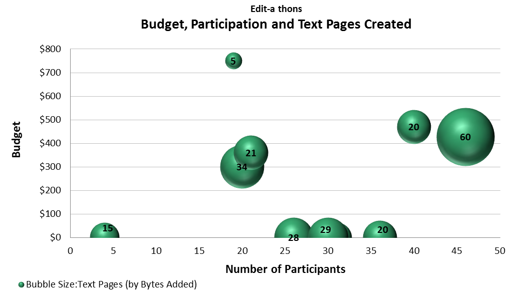
A bubble chart is a graphical tool that can be used to display data. In a bubble chart, each data point is represented by a bubble. The size of the bubble is proportional to the value of the data point. The size of the bubble can also be used to represent other data values, such as the value of a company’s assets. The color of the bubble is determined by the type of data point and can represent data values, such as the country of origin of a product.
Bubble charts are often used to visualize data about sales or other financial data. For example, you could use a bubble chart to compare the sales of different products in different regions. You could also use a bubble chart to compare the sales of the same product in different years.
A bubble chart can present data on how different entities compare in value.
Bubble charts can compare and contrast data between different entities. The size of the bubble represents the value of the entity, while the color of the bubble is representative of the entity’s category. This way, you can see how different entities compare in value at a glance. As a result, you can make more informed decisions when seeing how your company compares to others in its category or when trying to identify trends in your data.
Bubble charts can display and compare categorized data.
Bubble charts are an excellent way to visualize data broken down by category. For example, you could use a bubble chart to visualize the sales data for different product categories. The size of the bubbles would represent the sales volume for each category, and the color of the bubbles would represent the product type. This way, you can see how different product categories compare sales quickly and easily.
Bubble charts can present multiple data sets.

Bubble charts are ideal when trying to compare multiple data sets. The size of each bubble is relative to the data value within its set, while the bubbles’ color can indicate which set it belongs to. This can be extremely helpful for businesses trying to compare different sales figures or different customer demographics.
The size of each bubble is relative to the data value within its own set. In the example, the larger bubbles represent higher sales figures, while the smaller bubbles represent lower sales figures. The bubbles’ color can indicate which set it belongs to. For example, blue bubbles might represent product A sales figures in January, green bubbles could represent sales figures for product A in February, and red bubbles might represent sales figures for product A in March. This information could be valuable to a business when making strategic decisions about which products to promote or discontinue.
Bubble charts are a versatile analytical tool.
As you can see, a bubble chart can present many types of data. A bubble chart can be the ideal solution, whether you need to compare values, categorical data, or numerous sets of data.